Virus Geeks
Website
Website
Website
Overview
Overview
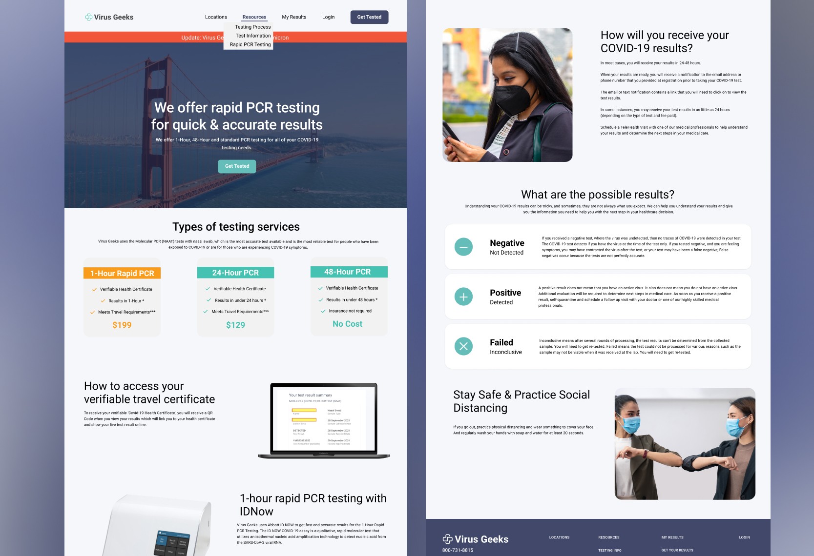
Virus Geeks, the largest COVID-19 testing company on the West Coast during the pandemic, relied heavily on its website to facilitate key services for its users.
Virus Geeks, the largest COVID-19 testing company on the West Coast during the pandemic, relied heavily on its website to facilitate key services for its users.
Virus Geeks, the largest COVID-19 testing company on the West Coast during the pandemic, relied heavily on its website to facilitate key services for its users.
During the height of the COVID-19 pandemic, Virus Geeks became a beacon for communities across the West Coast, offering critical testing services at an unprecedented scale. Their website was meant to serve as a bridge between anxious users and the testing solutions they desperately needed. Yet, this bridge was riddled with potholes: confusing navigation, inaccessible design, and a mobile experience that felt more like a hurdle race than a clear path to vital information. As the sole designer, I saw an opportunity to transform this digital lifeline into a seamless experience that met the urgency and inclusivity the moment demanded.
During the height of the COVID-19 pandemic, Virus Geeks became a beacon for communities across the West Coast, offering critical testing services at an unprecedented scale. Their website was meant to serve as a bridge between anxious users and the testing solutions they desperately needed. Yet, this bridge was riddled with potholes: confusing navigation, inaccessible design, and a mobile experience that felt more like a hurdle race than a clear path to vital information. As the sole designer, I saw an opportunity to transform this digital lifeline into a seamless experience that met the urgency and inclusivity the moment demanded.
During the height of the COVID-19 pandemic, Virus Geeks became a beacon for communities across the West Coast, offering critical testing services at an unprecedented scale. Their website was meant to serve as a bridge between anxious users and the testing solutions they desperately needed. Yet, this bridge was riddled with potholes: confusing navigation, inaccessible design, and a mobile experience that felt more like a hurdle race than a clear path to vital information. As the sole designer, I saw an opportunity to transform this digital lifeline into a seamless experience that met the urgency and inclusivity the moment demanded.
Tech Stack
Figma
Design Tool

Jira
Project Tracking Software
Tech Stack
Figma
Design Tool
Jira
Project Tracking Software
Tech Stack
Figma
Design Tool
Jira
Project Tracking Software
Tech Stack
Figma
Design Tool
Jira
Project Tracking Software
Problem Statement
The problems were as urgent as the pandemic itself. Users needed to locate testing sites quickly, access their results effortlessly, and obtain travel certificates without unnecessary delays. Instead, they were met with labyrinthine navigation that sent many straight to the customer support queue. Mobile users—comprising the majority—faced clunky interactions that often ended in frustration. For individuals with disabilities, the site was practically unusable, lacking basic accessibility features. Virus Geeks was at risk of losing user trust during a time when reliability mattered most.
Approach
I started by immersing myself in the perspectives of both users and support staff. Conversations with users revealed a shared sense of urgency and frustration: they needed clarity, speed, and simplicity. For the support staff, the website’s inadequacies translated directly into a flood of help requests, overburdening their already stretched team. Armed with these insights, I embarked on redesigning the site with a mobile-first mindset and a commitment to accessibility.
My wireframes were shaped by the stories I heard. A mother navigating on her phone while juggling work, desperate to find a nearby testing site for her child. A visually impaired traveler struggling to download a certificate to meet a flight deadline. These stories drove decisions like implementing responsive design for seamless mobile use and incorporating ARIA labels to ensure screen reader compatibility. The design wasn’t just about functionality—it was about dignity and empowerment.
Solution
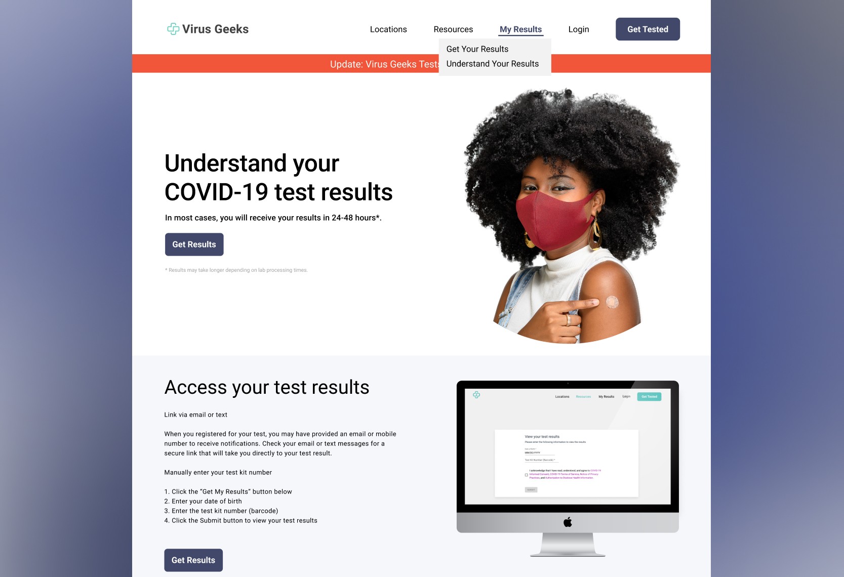
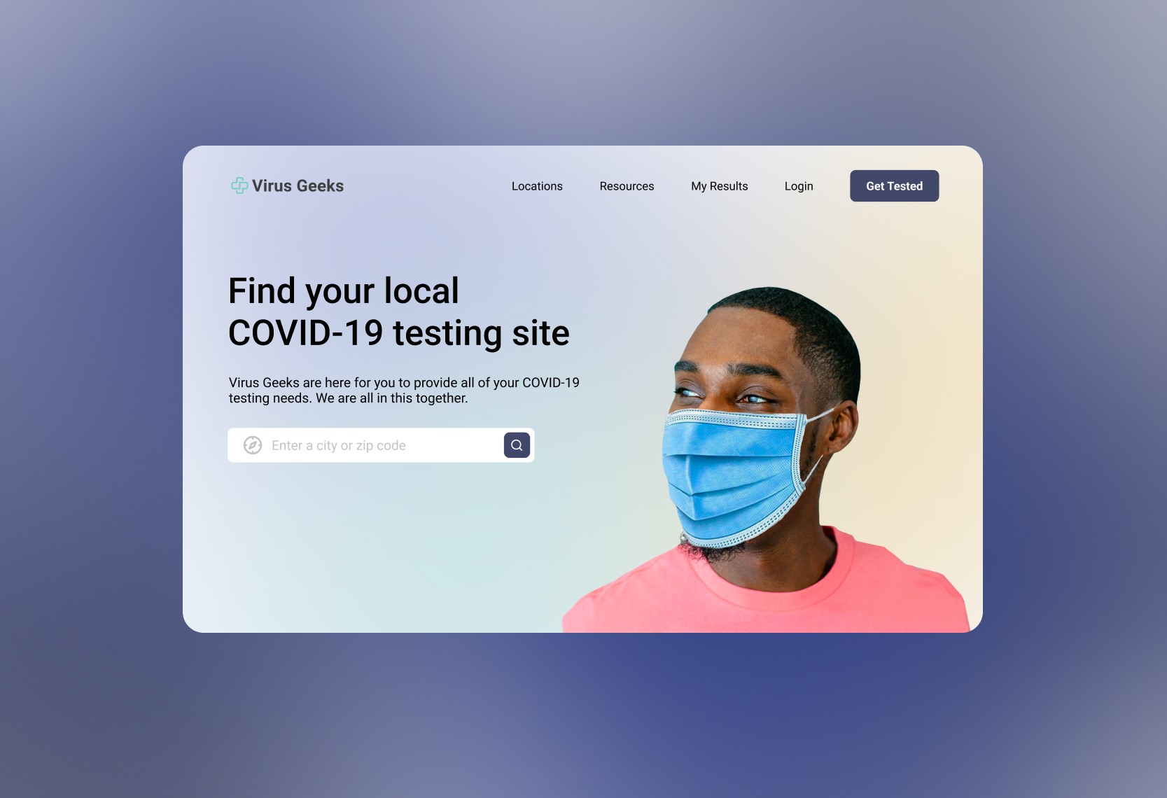
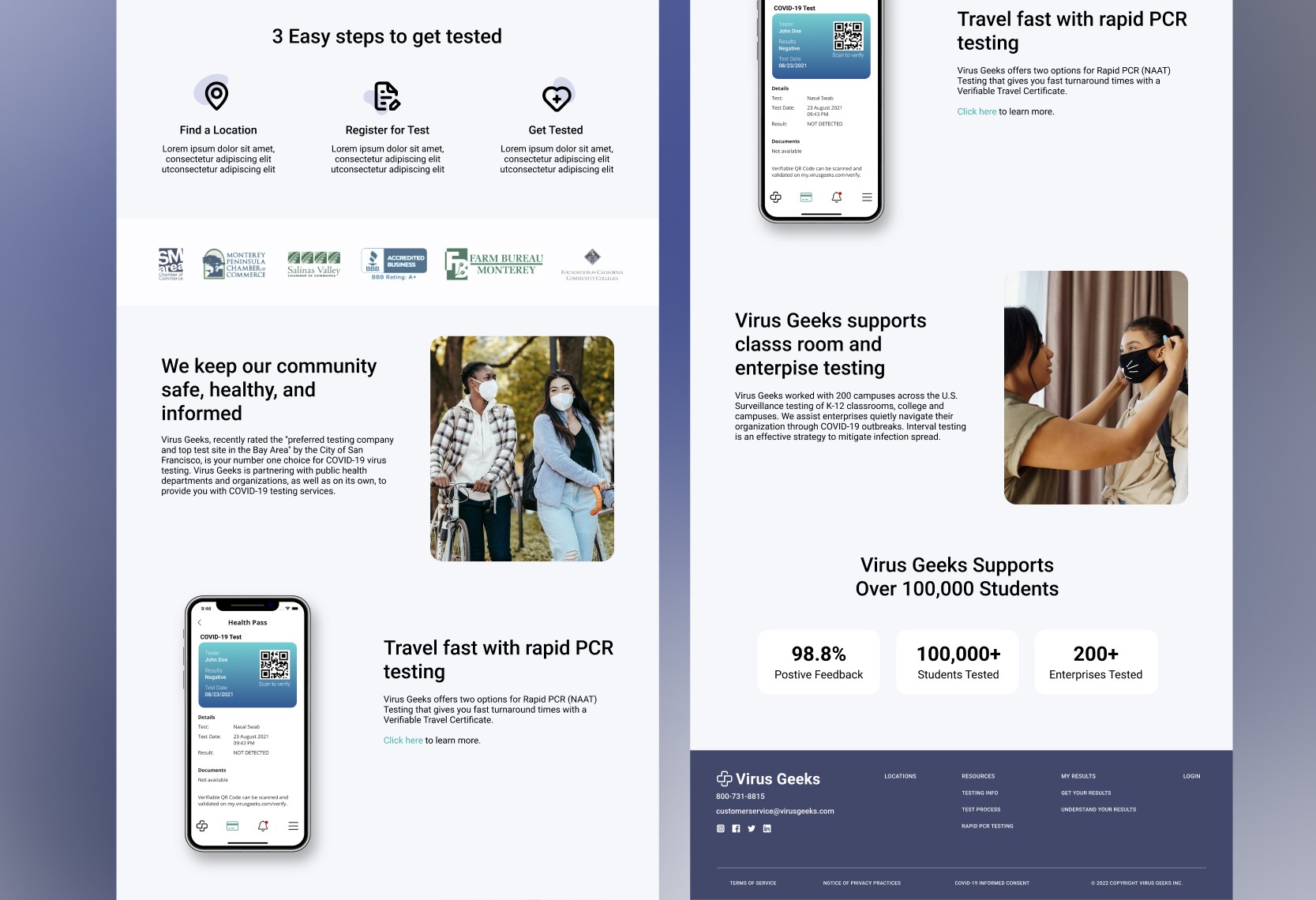
The redesigned website became a digital cornerstone for Virus Geeks, embodying clarity, inclusivity, and efficiency. Users could now pinpoint their nearest testing site in seconds, thanks to an intuitive location-based search. The process of retrieving test results and downloading travel certificates was simplified into clear, guided steps, dramatically reducing confusion. The accessibility enhancements were transformative: individuals with disabilities could now navigate the site confidently, aligning with Virus Geeks’ mission to serve every community.
The impact was immediate and measurable. Drop-off rates plummeted by 30%, and mobile engagement surged by 50%, as users found the new experience seamless and intuitive. Customer support tickets related to navigation issues dropped by 40%, freeing the team to focus on other critical tasks. Perhaps most importantly, user feedback shifted from frustration to gratitude—comments poured in from people who finally felt seen and supported by the platform.
This wasn’t just a website redesign; it was a reimagining of how a digital tool could support a community in crisis. By meeting users where they were—on their phones, in moments of urgency—I helped Virus Geeks turn a pain point into a point of pride.
Approach
I started by immersing myself in the perspectives of both users and support staff. Conversations with users revealed a shared sense of urgency and frustration: they needed clarity, speed, and simplicity. For the support staff, the website’s inadequacies translated directly into a flood of help requests, overburdening their already stretched team. Armed with these insights, I embarked on redesigning the site with a mobile-first mindset and a commitment to accessibility.
My wireframes were shaped by the stories I heard. A mother navigating on her phone while juggling work, desperate to find a nearby testing site for her child. A visually impaired traveler struggling to download a certificate to meet a flight deadline. These stories drove decisions like implementing responsive design for seamless mobile use and incorporating ARIA labels to ensure screen reader compatibility. The design wasn’t just about functionality—it was about dignity and empowerment.
Solution
The redesigned website became a digital cornerstone for Virus Geeks, embodying clarity, inclusivity, and efficiency. Users could now pinpoint their nearest testing site in seconds, thanks to an intuitive location-based search. The process of retrieving test results and downloading travel certificates was simplified into clear, guided steps, dramatically reducing confusion. The accessibility enhancements were transformative: individuals with disabilities could now navigate the site confidently, aligning with Virus Geeks’ mission to serve every community.
The impact was immediate and measurable. Drop-off rates plummeted by 30%, and mobile engagement surged by 50%, as users found the new experience seamless and intuitive. Customer support tickets related to navigation issues dropped by 40%, freeing the team to focus on other critical tasks. Perhaps most importantly, user feedback shifted from frustration to gratitude—comments poured in from people who finally felt seen and supported by the platform.
This wasn’t just a website redesign; it was a reimagining of how a digital tool could support a community in crisis. By meeting users where they were—on their phones, in moments of urgency—I helped Virus Geeks turn a pain point into a point of pride.